How A Positive User Experience Can Help You Manage Your City
.png)
Zencity
The Platform for Community Trust
With technology evolving at the speed of light, cities are doing a tremendous job going digital. Local government agencies are rising to the challenge and adopting new innovations. In doing so, they are boosting organizational efficiency and improving the services they provide citizens.
As a User Experience (UX) designer at Zencity, I’ve been impressed by the tech solutions available to cities. My work in the space has pointed me to two main game changers that differentiate star solutions. First, that the products address city-specific challenges. Second, that the products are easy for the city to adopt and use on a daily basis. As a result, as a UX designer, my goal from the get-go has been to introduce cities to new solutions that are first and foremost relevant, and secondly, that can be implemented in the city with zero effort. This means introducing cities to a product that has user experience in mind.
Creating User-Friendly Smart City Products
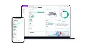
At Zencity, we’re tackling citizen engagement – a city issue very much in need of an upgrade. We’ve done this by developing state-of-the-art, cutting-edge machine learning algorithms to automatically help cities understand their citizens. Our goals are to help cities step up from archaic, inefficient solutions to up-to-date, relevant solutions that will provide them the most useful tools for decision-making in the city. It’s been my role to transform our technology into a user-friendly, self-explanatory platform to help any city employee, no matter their role, analyze and understand their citizens’ needs in the most beneficial way. In this blog post, I’ll share a bit of my design-thinking process and how we transformed leading technology into an intuitive and friendly product.
A well designed product can be a crucial tool in helping city managers operate in a more insightful, efficient way. These are the reasons why I think well designed products are so important for cities:
Good UX Helps Cities Save Time
Designing the proper user experience can shorten the time it takes to accomplish critical tasks. For me, the way to design a proper UX is to know the user and their workflow — in my case, this means really understanding how cities are run. As designers, knowing our users is the most important thing for us. In order to build good products, I have to admit that I don’t know the right answer and the right solution for my user. Instead, what guides me is the knowledge that the user is my champion, and s/he knows what is best for them. Most of our product design decisions are made by asking the right questions and analyzing usage patterns and this means working intricately with our users – city managers and decision-makers. In addition to saving time in actual workflow, good products should not burden the user – they should be time-saving from the start. That’s why we built and are continuously building solutions that are easy to understand with a smooth and fast learning curve so the user will be able to “jump in” quickly.

Reduce Errors with Simple User Interface Design
Part of human nature is making mistakes. Erring on a city scale can have a vast impact – even the smallest action can potentially affect a large number of people. That’s why managing a city is so hard. We understand the enormous responsibility our users have, and how complicated and multifaceted their work is. To ensure our users don’t shoot in the dark, as a designer I must design the right interfaces so that they actually reduce abuse or human errors. A well designed product decreases rather than increases workload for the city, and should reduce human error. It shouldn’t require additional time to learn the product or to fix mistakes made in reliance on the product, rather the product should be saving the city time and effort.
Data Visuals that Add Value for City Officials
Being a data-based platform, one of our biggest design challenges is in presenting vast amounts of complex data in a way that is clear and understandable to our users. One of our main goals is showing our users the “big picture” of what their citizens are thinking and feeling. Generally, people tend to think that the way platforms are used is by slowly going through all the information on the screen, but that’s actually the opposite way from which people tend to engage with digital interfaces. The first thing a user will do is quickly scan the screen and get a general idea of what is going on, just like reading a menu at a restaurant. The principle that guided me while I designed our different screens and interfaces is therefore that I had to give users a good enough understanding at first glimpse so they can learn something new from the first moment they log in, and then enable them to scan slowly through all the important information. A well designed product needs to create value for the city and not just provide more-of-the-same, and that’s what our data visuals do.
In addition to showing the “big picture” of what’s happening in the city, we never forget our users׳ most important element: the citizens themselves. Each city resident has his or her own unique story and that’s why we show cities a holistic view of their citizens’ cumulative voices along with the story level view of what exactly people are saying and how they are feeling. That’s why we designed and built a screen on our platform in which users can conveniently read the most important and relevant (leading) stories in their city.
A well designed product helps cities react in real time
We believe “strike while the iron is hot” is even more relevant when managing a city so we’re constantly working on new ways to get our users information and data in real-time. We’ve therefore designed and built real-time, customizable notifications that can be seen in the system, sent via email, or pushed to a users phone so that s/he doesn’t have to be logged into the system to stay up-to-date.
Additionally, we know that these days, many of our users aren’t sitting in front of their desktops but are working on the go. That’s why we designed a mobile app — no easy feat in data visualization — so that our users can stay on top of their game and be connected in real-time in the office and on the go. A well designed product doesn’t require extra work from the city – it’s available to the city at the touch of a finger when and wherever it’s needed.
A Well Designed Product is Fun to Use
Last but not least, designing a good product is not only about gathering beautiful pixels but also about creating a well defined, easy, delightful and insightful experience. At the junction of heavy decisions, it is always more fun using a platform that is fresh and actually user-friendly.
Designing Smart City Solutions Doesn’t have to be Complicated
Big data technologies are crucial for cities to adopt as part of the technology revolution. The secret of leveraging big data lays in knowing how to distinguish relevant and irrelevant, important from not important. By using good design alongside advanced technology we can give cities exclusive access to prioritized, real-time, relevant, and crucial data.
We all love cities and what they are offering us. At Zencity, we are forging ahead with a shared desire for making urban life in cities better. The combination of passion for cities and designing good products is the best recipe for good Smart City and GovTech solutions.
Stay tuned for future posts about specific interface and user experience design case studies based on how we overcome challenges in our journey for building suitable solutions for local governments.
%20copy-1.png?width=544&height=120&name=Logo_black%20(1)%20copy-1.png)


