Why Nobody’s Using Your City App, And Why This Should Matter

Eyal Feder Levy
CEO & Co-Founder
Recently I had the pleasure of lecturing about data, technology and cities to top tier executives of a major municipality in Israel. Towards the end of the talk, I showed a few examples of Israeli city apps, and argued that they are very poorly designed, and therefore underused. This sparked a very interesting conversation with this municipality’s CIO, who invited me to provide a critical view of their app. I decided to get right on it – after all, how often do you get a public official’s open invitation for criticism?
Rather than getting back to her in writing or conversation, I decided I’m going to publish all my findings and thoughts in a blog post. After all, we in Zencity love cities and data, and we think our findings and thoughts might be useful to other cities as well.
First, some interesting data:
About 50 of Israel’s 247 municipalities offer a city app on the iTunes Appstore and/or Google Play. An impressive number, considering the fact that municipalities can usually spend IT budgets only on necessities. I find this figure encouraging: it seems that local government officials do want to engage their citizens, and seek solutions to enable their municipalities to be better connected to citizens.

However, if you ask around your friends if they’re aware of their municipal app, they’d probably say no, and even if they’ve downloaded it and used it, it was probably only once.
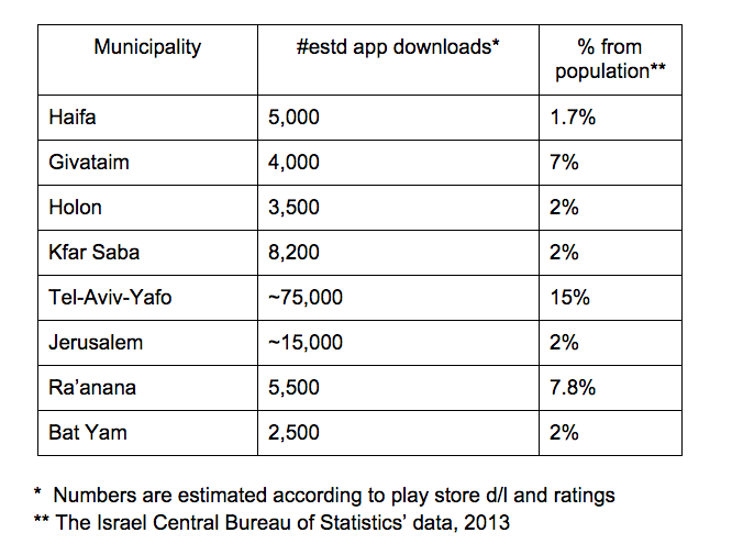
To corroborate this, here are some statistics of apps of a few Israeli municipalities, and their estimated downloads (mind you, these are not actual uses):

The above figures serve as an indication that something’s clearly not working. Even in the case of outliers such as Tel Aviv, and, arguably, Ra’anana and Givatayim, you’d think that more than a fraction of the population actually cares about what’s going on in their neighborhood or would want to fix something that’s not right. If that wasn’t the case, municipalities would not deploy public services or the city hotline (“moked 106” in Israel – 311 in the States).
Why are there such low download / usage rates of city apps?
Here is my analysis:
A) Cramming:
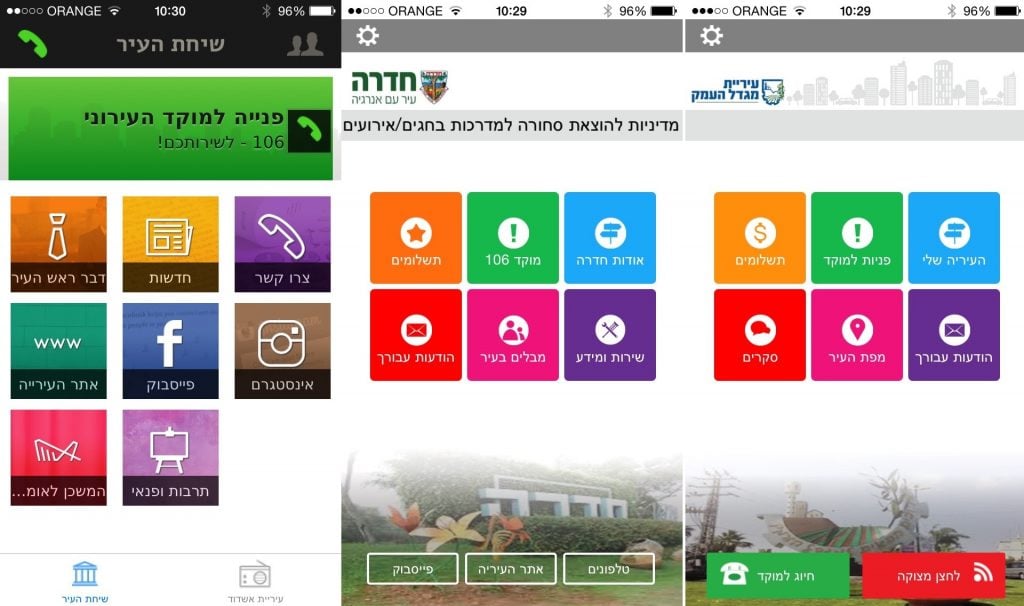
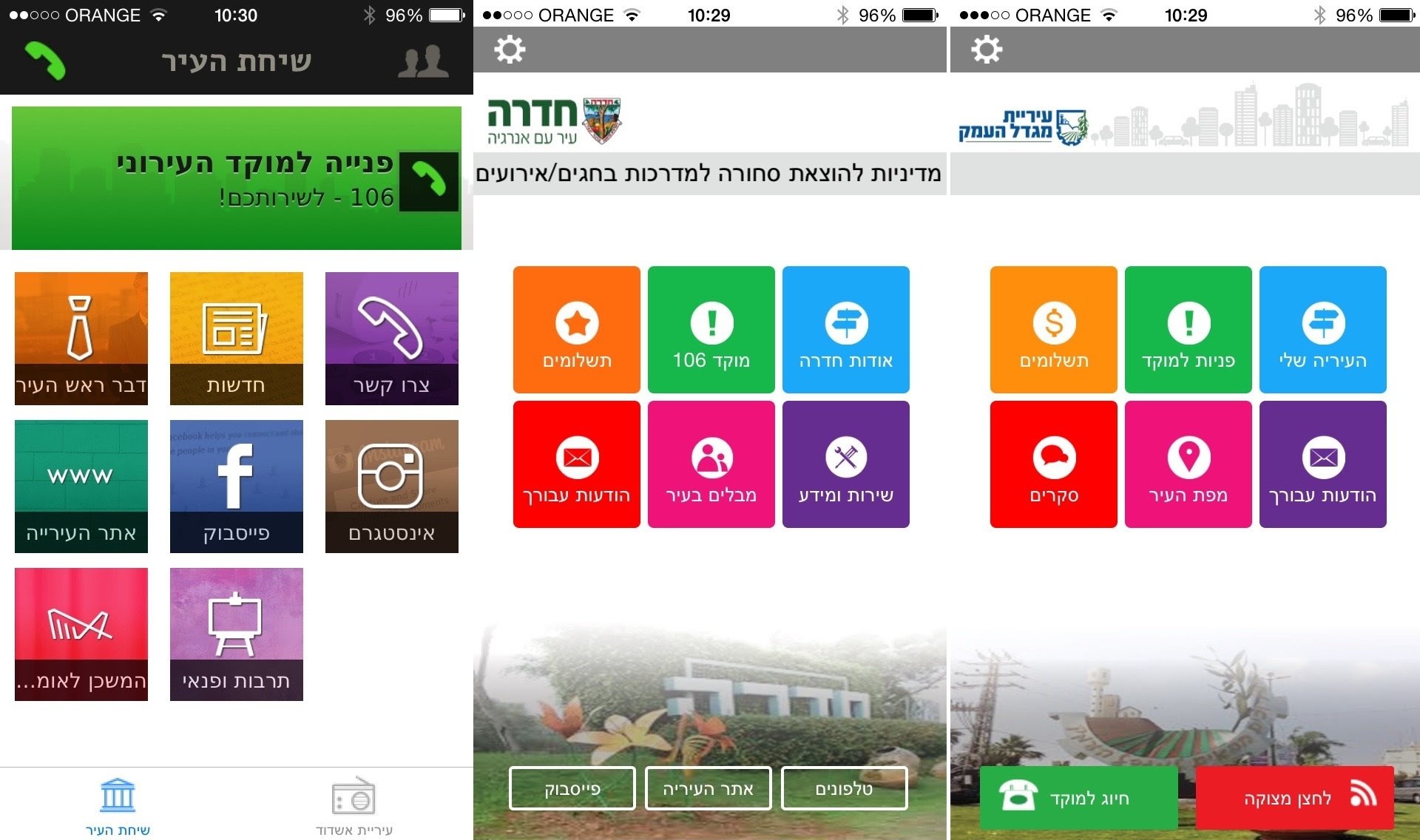
Take a look at the average Israeli municipal app. It has everything, and I do mean everything put into it, and for to best intentions. So, we have the Mayor’s blessing and the city’s YouTube channel, next to the bill pay service and the 106 city hotline. If we assign priorities to every screen from a citizen’s perspective, we could easily leave in only important ones.
B) In-cohesiveness:
The Israeli apps do contain many interfaces to the municipality. Some, as mentioned before, are more critical. Therefore, it’s beyond my comprehension why for some of these, like payments, users are then shoved back to the non-mobile-friendly website of the municipality, where they have to struggle with very small fonts that don’t fit their 10-20 cm screens. If you want people using your website, why build an app, and if you want them to keep using your app, why throw them back to the website?
C) Cloning (city-side):
Take a look at the 4 different screenshots around the post. Notice they all look the same? Now, as software professionals, we do believe in copying and reusing what’s working. But why copy models that clearly don’t work? We, the citizens, are not clones. Cities are not clones – they each have different priorities and different goals for the app (some may want to have it to reduce the calls to their city hotline, others may want to promote events and offer easy payments). Cities are different, so should be their apps.
D) Cloning (citizens-side):
Now, assuming all your users or citizens, are clones, is even worse. True, they might all have some functions that are common, but as a city government, you do realize that bachelors living in your city, young families, the elderly and even local businesses, all have different needs. An ideal app should reflect at least some change according to the user’s group.

What to do in order to increase your City App’s usage and realize your municipality’s goals?
The advice is simple, and may actually be applicable also to non-municipal apps:
- Know your goals: Why are you deploying a municipal app? What do you consider a success? What functionality gets the top priority in your view?
- Design by your goals: Only the main functionality should be on the main screen
- Keep it cohesive: What starts in the app, should stay in the app, including payments and information search
- Keep it simple: The main user scenarios (“report something to the hotline / search for a department’s phone number / get updated on the news”) should not be more than a few taps/swipes and one screen away, at all times.
- Update users with relevant information: Use user notification sparingly, and if possible, in relevance to the user, and get rewarded by people actually coming back to use the app.
- Always leave room for user feedback: Review your app’s Google Play / iTunes page, and leave a “contact us” form in the app, to know what your users care about. More advanced users should monitor analytics to see what got tapped on most often.
- Consider about the user’s point of view: What should be her main association thinking about using the app? Try and have your app do mostly that. If different users have different associations (one is thinking about hotline reporting and another about bill payments or kindergarten registration) consider having different layouts or even different apps altogether for different services.
We honestly believe in scaling things that work – why scale things that clearly don’t? We hope to start seeing awesome city apps out there. In fact, we just might have one in the works. If your city is interested in building a better city app – contact us.
Lastly – a thank you to my friends and colleagues – Yogev Sharvit and Dr. Tehilla-Schwartz Altschuer, who helped with opinions and data, and Eyal Feder, my cofounder who incentivized my writing and provided his wise perspectives.
%20copy-1.png?width=544&height=120&name=Logo_black%20(1)%20copy-1.png)


